Cecilia's Site
My class work for bimm143 at UC San Diego
Lab 7 Principal Component Analysis (PCA)
Cecilia Wang (PID:18625854)
Background
Today we will begin our exploration of important machine learning methods with a focus on clustering and dimensionality reduction.
To start testing these methods, let’s make up some sample data to cluster where we know what the answer should be.
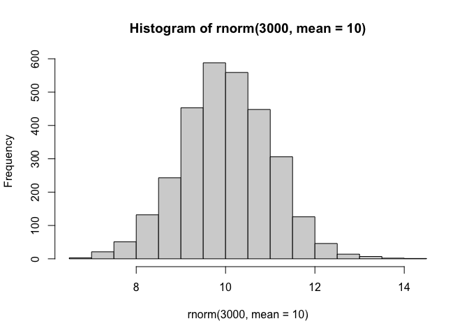
hist(rnorm(3000,mean=10))
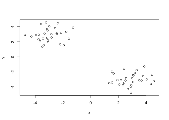
Q. Can you geenrate 30 numbers centered at +3 and 30 numbers at -3 taken at random from a normal distribution?
tmp<- c(rnorm(30,mean=3), rnorm(30,mean=-3))

x<-cbind(x=tmp, y=rev(tmp))

plot(x)
K-means clustering
The main function in “base R” for k-means clustering is called
kmeans(), let’s try it out.
k <- kmeans(x,2)
k
K-means clustering with 2 clusters of sizes 30, 30

Cluster means:
          x         y
1 -2.983481  2.895122
2  2.895122 -2.983481

Clustering vector:
 [1] 2 2 2 2 2 2 2 2 2 2 2 2 2 2 2 2 2 2 2 2 2 2 2 2 2 2 2 2 2 2 1 1 1 1 1 1 1 1
[39] 1 1 1 1 1 1 1 1 1 1 1 1 1 1 1 1 1 1 1 1 1 1

Within cluster sum of squares by cluster:
[1] 41.09069 41.09069
 (between_SS / total_SS =  92.7 %)

Available components:

[1] "cluster"      "centers"      "totss"        "withinss"     "tot.withinss"
[6] "betweenss"    "size"         "iter"         "ifault"
Q. What component of your kmeans result object has the cluster center?
k$centers
          x         y
1 -2.983481  2.895122
2  2.895122 -2.983481
Q. What component of your kmeans result object has the cluster size (i.e. how many points are in each cluster) ?
k$size
[1] 30 30
Q. What component of your kmeans result object has the cluster membership vector(i.e. the main clustering result, which points are in which cluster)?
k$cluster
 [1] 2 2 2 2 2 2 2 2 2 2 2 2 2 2 2 2 2 2 2 2 2 2 2 2 2 2 2 2 2 2 1 1 1 1 1 1 1 1
[39] 1 1 1 1 1 1 1 1 1 1 1 1 1 1 1 1 1 1 1 1 1 1
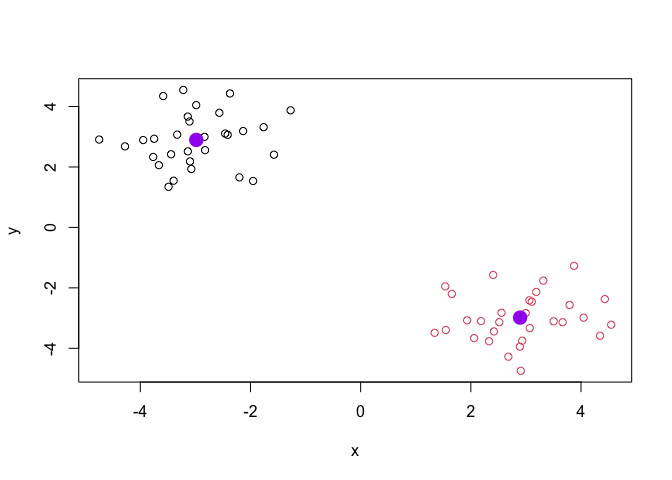
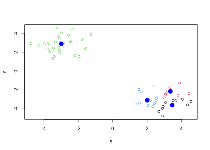
Q. Plot the results of cluster (i.e our data colored by the clustering result) along with the cluster centers.
plot(x,col=k$cluster)
points(k$center,col="purple",pch=16,cex=2)
Q. Can you run kmeans again and cluster into 4 clusters and plot the results just like we did above with coloring by cluster and the cluster centers shown in blue?
k4 <- kmeans(x,4)
k4$size
[1] 10 9 30 11
k4$cluster
 [1] 2 1 2 4 2 2 2 4 2 4 1 4 1 1 4 4 4 2 1 4 1 1 1 2 1 1 2 4 4 4 3 3 3 3 3 3 3 3
[39] 3 3 3 3 3 3 3 3 3 3 3 3 3 3 3 3 3 3 3 3 3 3
plot(x,col=k4$cluster)
points(k4$center,col="blue",pch=16,cex=2)
Key-point: Kmeans will always return the clustering that we ask for (this the “K” or “centers in K-means)!
Hierarchical clustering
The main function for hierarchical clustering in base R is called
hclust().One of the main differences with respect to the kmeans()
function is that you can not just pass your input data directly to
hclust() - it needs a “distance matrix” as input. We can get this from
lot’s of places including the dist() function.
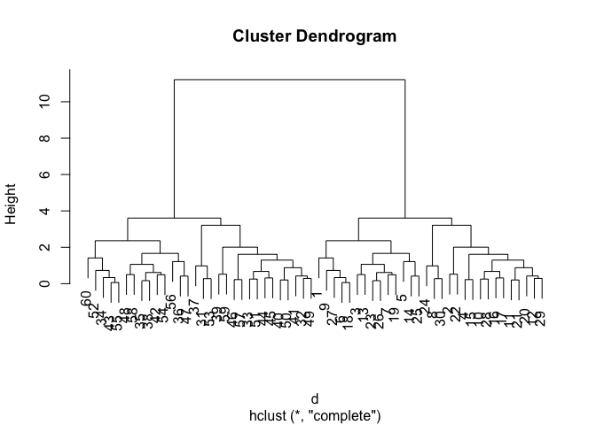
d <- dist(x)
hc <- hclust(d)
plot(hc)
We can “cut” dendrogram or “tree” at a given height to yield our
“clusters”. For this we use the function cutres().
plot(hc)
abline(h=10,col="red")
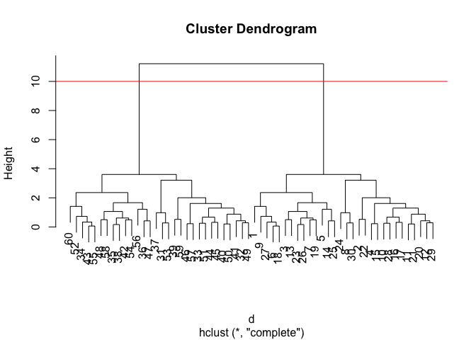
grps <- cutree(hc, h=10)
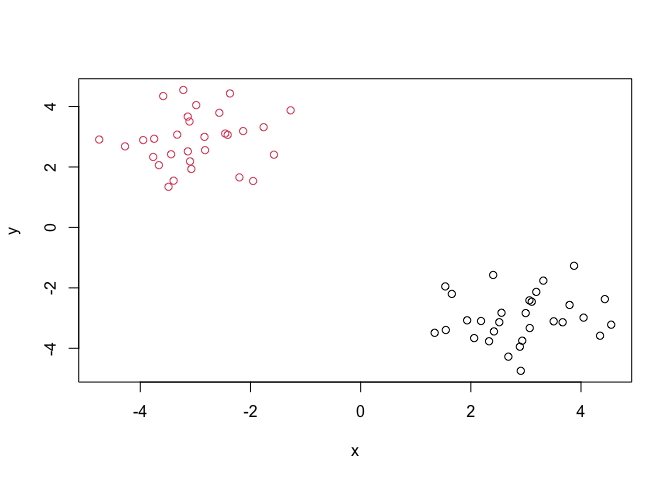
Q. Plot our data
xcolored by the clustering result fromhclust()andcutree()?
plot(x,col=grps)
Principal Component Analysis (PCA)
PCA is a popular dimensionality reduction technique that is widely used in bioinformatics.
PCA of UK food data
url <- "https://tinyurl.com/UK-foods"
x <- read.csv(url)

rownames(x) <- x[,1]
x <- x[,-1]
head(x)
               England Wales Scotland N.Ireland
Cheese             105   103      103        66
Carcass_meat       245   227      242       267
Other_meat         685   803      750       586
Fish               147   160      122        93
Fats_and_oils      193   235      184       209
Sugars             156   175      147       139
A better way to do this is fix the row names assignment at import time:
x <- read.csv(url, row.names=1)
head(x)
               England Wales Scotland N.Ireland
Cheese             105   103      103        66
Carcass_meat       245   227      242       267
Other_meat         685   803      750       586
Fish               147   160      122        93
Fats_and_oils      193   235      184       209
Sugars             156   175      147       139
Q1. How many rows and columns are in your new data frame named x? What R functions could you use to answer this questions?
dim(x)
[1] 17 4
Q2. Which approach to solving the ‘row-names problem’ mentioned above do you prefer and why? Is one approach more robust than another under certain circumstances?
The second method is better.
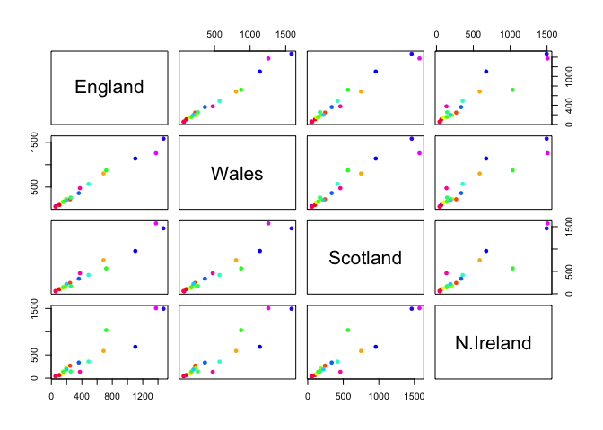
Q5: We can use the pairs() function to generate all pairwise plots for our countries. Can you make sense of the following code and resulting figure? What does it mean if a given point lies on the diagonal for a given plot?
pairs(x, col=rainbow(nrow(x)), pch=16)
library(pheatmap)

pheatmap( as.matrix(x) )
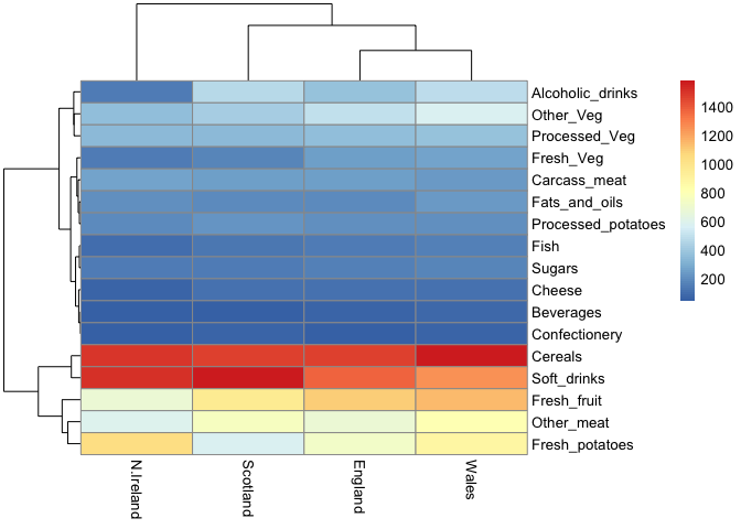
Q6. Based on the pairs and heatmap figures, which countries cluster together and what does this suggest about their food consumption patterns? Can you easily tell what the main differences between N. Ireland and the other countries of the UK in terms of this data-set?
Wales,England, Scotland cluster together, N.Ireland is in the other cluster. Main difference between N.Ireland and other countries are consumption in: Alcoholic drinks, fresh potatoes, fresh fruits, and other meats.
Of all these plot really only the paris() plot was useful.This however
took a bit of work to interpret a large dataset.
PCA to rescue
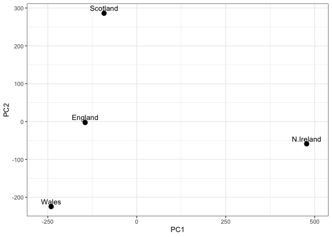
The main function in “base R” for PCA is called prcomp().
pca <- prcomp( t(x) )
summary(pca)
Importance of components:
                            PC1      PC2      PC3     PC4
Standard deviation     324.1502 212.7478 73.87622 2.7e-14
Proportion of Variance   0.6744   0.2905  0.03503 0.0e+00
Cumulative Proportion    0.6744   0.9650  1.00000 1.0e+00
Q. How much varance is captured in the first PC?
67.44%
Q. How many Pcs do I need to capture at least 90% of the total variance i the dataset?
2 PCs capture 96.5% total variance.
Q. Plot our main PCA result.
attributes(pca)
$names
[1] "sdev"     "rotation" "center"   "scale"    "x"

$class
[1] "prcomp"
To generate our PCA score plot we want to use the pca$x
# Create a data frame for plotting
df <- as.data.frame(pca$x)
df$Country <- rownames(df)

# Plot PC1 vs PC2 with ggplot
library(ggplot2)
ggplot(pca$x) +
  aes(x =PC1, y = PC2, label = rownames(pca$x)) +
  geom_point(size = 3) +
  geom_text(vjust = -0.5) +
  xlim(-270, 500) +
  xlab("PC1") +
  ylab("PC2") +
  theme_bw()
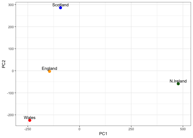
Q8. Customize your plot so that the colors of the country names match the colors in our UK and Ireland map and table at start of this document.
my_cols <-c("orange","red","blue","darkgreen")

ggplot(pca$x) +
  aes(x =PC1, y = PC2, label = rownames(pca$x)) +
  geom_point(size = 3,col=my_cols) +
  geom_text(vjust = -0.5) +
  xlim(-270, 500) +
  xlab("PC1") +
  ylab("PC2") +
  theme_bw()
Digging deeper (variable loadings)
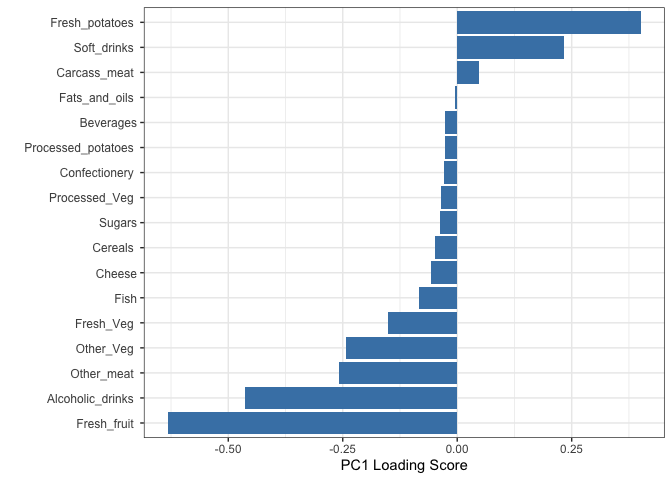
How do the original variables (i.e. the 17 different foods) contribute to our new PCs?
PC1 plot loading plot
## Lets focus on PC1 as it accounts for > 90% of variance
ggplot(pca$rotation) +
  aes(x = PC1,
      y = reorder(rownames(pca$rotation), PC1)) +
  geom_col(fill = "steelblue") +
  xlab("PC1 Loading Score") +
  ylab("") +
  theme_bw() +
  theme(axis.text.y = element_text(size = 9))
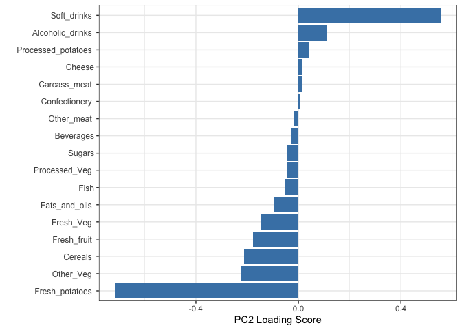
PC2 plot loading plot
ggplot(pca$rotation) +
  aes(x = PC2,
      y = reorder(rownames(pca$rotation), PC2)) +
  geom_col(fill = "steelblue") +
  xlab("PC2 Loading Score") +
  ylab("") +
  theme_bw() +
  theme(axis.text.y = element_text(size = 9))