head(cars) speed dist
1 4 2
2 4 10
3 7 4
4 7 22
5 8 16
6 9 10There are a lot of ways to make figures in R. These include so-called “base R” graphics. (e.g. plot()) and tones of add-on packages like ggplot2.
For example here we make a same plot with both:
head(cars) speed dist
1 4 2
2 4 10
3 7 4
4 7 22
5 8 16
6 9 10plot(cars)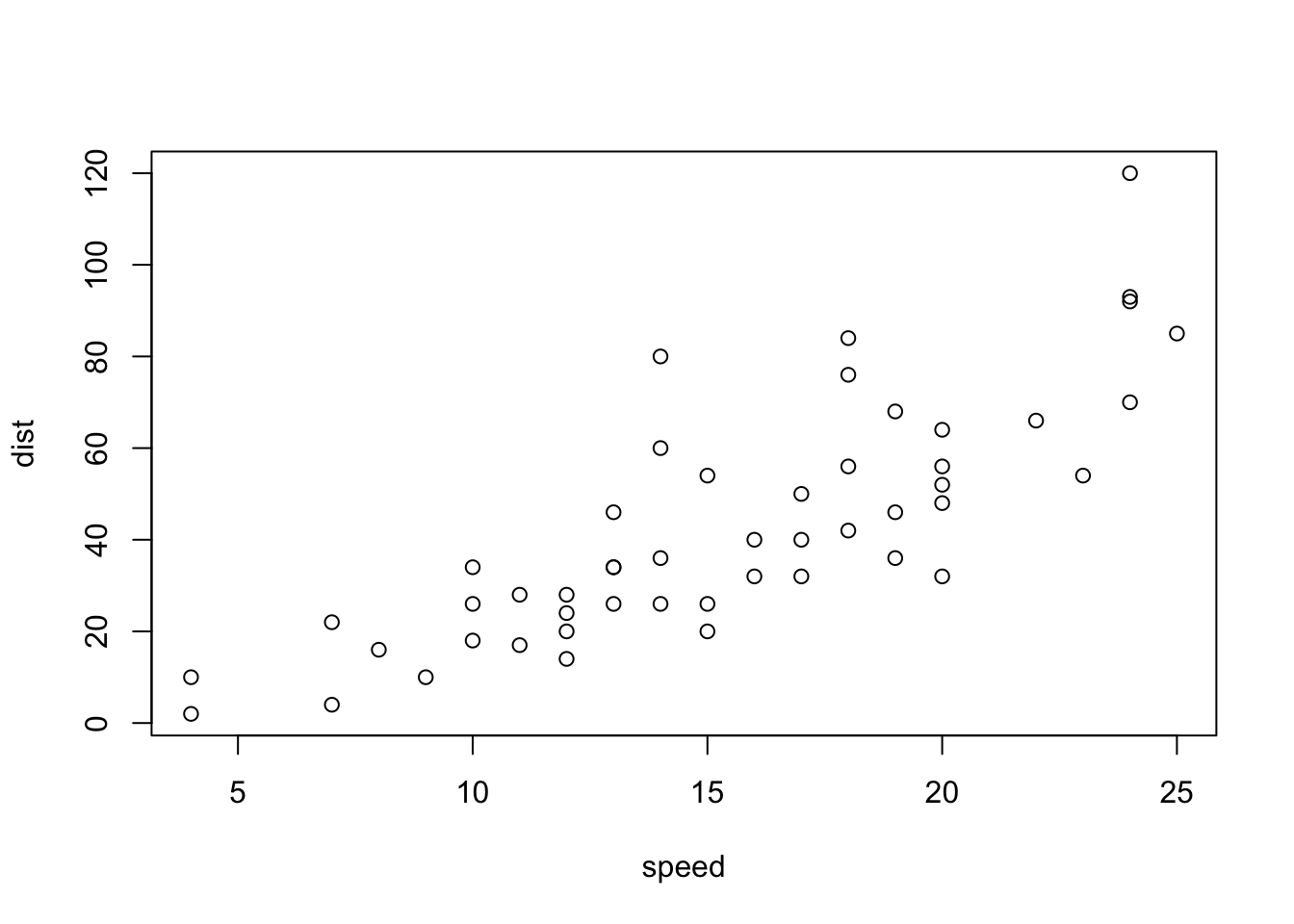
First I need to install the package with the command install.packages().
N.B. We never run an install cmd in a quarto code chunk or we will end up re-installing packages many many times- whcih is not we want!
Every time we want to use one of these “add-on” packages we need to load it up in R withlibrary() function:
library(ggplot2)
ggplot(cars)
Every ggplot need at least 3 things:
p <- ggplot(cars)+
  aes(x=speed, y=dist)+
  geom_point()+
  geom_smooth(method = "lm", se = FALSE, color="purple")+
  labs(title = "Stopping distance of old cars", subtitle = "data from the `cars` object", x="Speed (mph)", y="Distance (ft)")
render it out
p`geom_smooth()` using formula = 'y ~ x'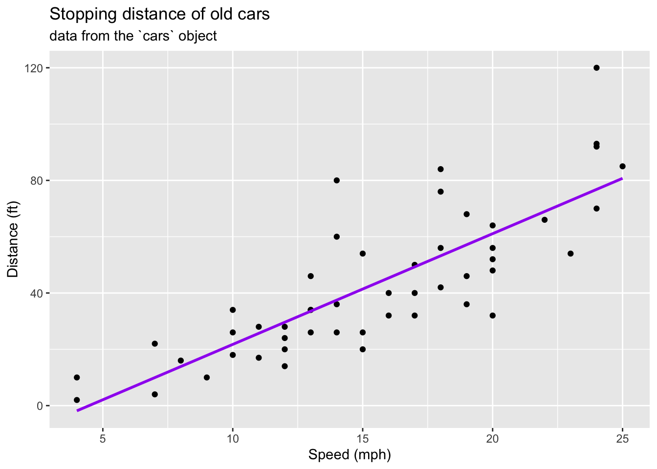
p+theme_bw()`geom_smooth()` using formula = 'y ~ x'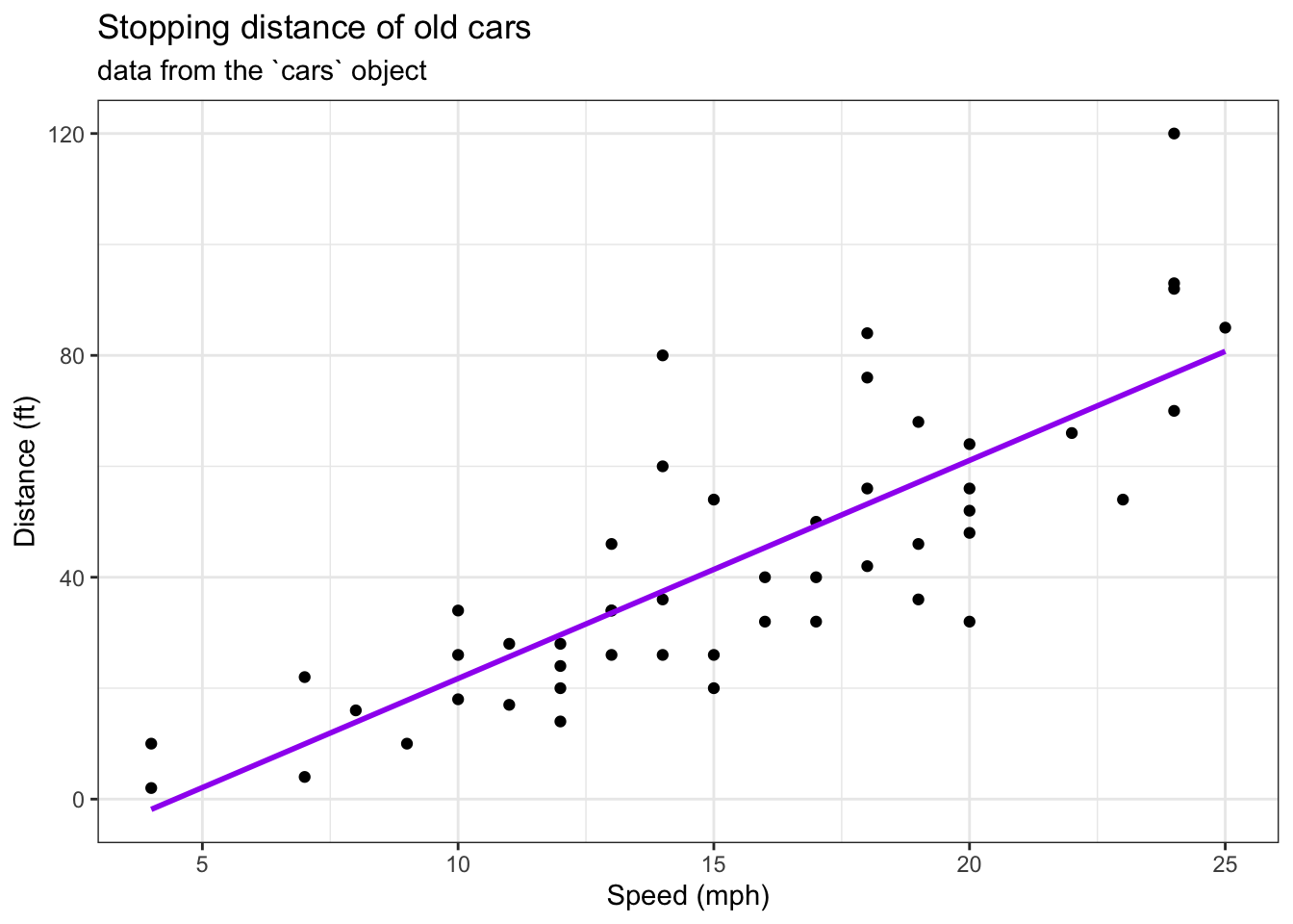
We can read the input data data the class website
url <- "https://bioboot.github.io/bimm143_S20/class-material/up_down_expression.txt"
genes <- read.delim(url)
head(genes)
Gene Condition1 Condition2 State
1 A4GNT -3.6808610 -3.4401355 unchanging
2 AAAS 4.5479580 4.3864126 unchanging
3 AASDH 3.7190695 3.4787276 unchanging
4 AATF 5.0784720 5.0151916 unchanging
5 AATK 0.4711421 0.5598642 unchanging
6 AB015752.4 -3.6808610 -3.5921390 unchangingnrow(genes)[1] 5196A first version plot
ggplot(genes)+
  aes(Condition1, Condition2) +
  geom_point()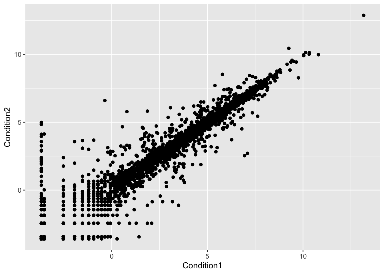
table(genes$State)
      down unchanging         up
        72       4997        127
Version 2 plot, let’s color by State so we can see the “u”p and “down” significant genes compared to all the unchanging genes.
ggplot(genes)+
  aes(Condition1, Condition2, col=State) +
  geom_point()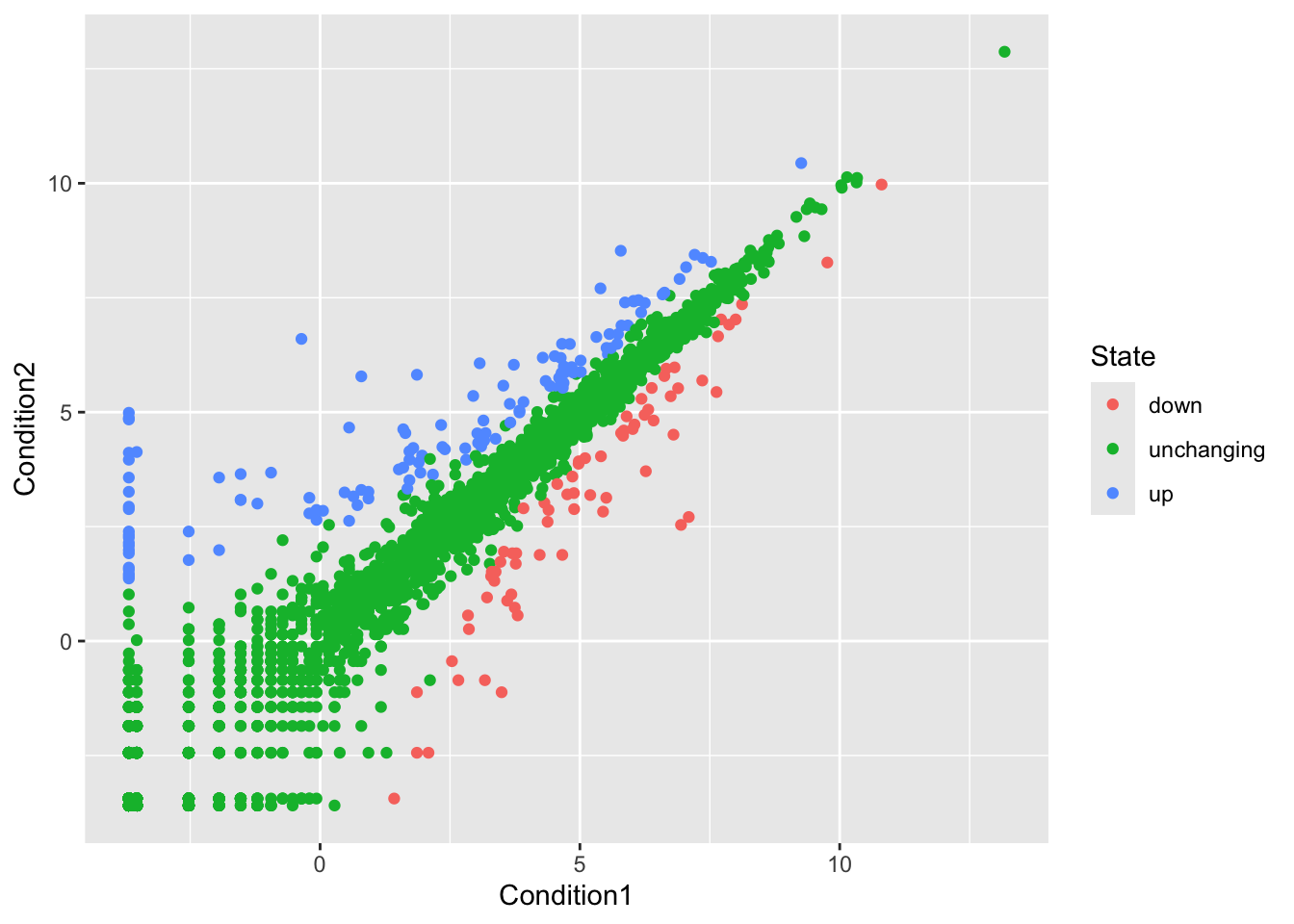
Version 3 plot, let’s modify the colors to something we like:
ggplot(genes)+
  aes(Condition1, Condition2, col=State) +
  geom_point() +
  scale_color_manual(values = c("Blue","grey","red"))+
  labs(x="Control (no drug)", y="Drug",
       title = "Gene Expression Change upon GLP-1 Drug")+
  theme_linedraw()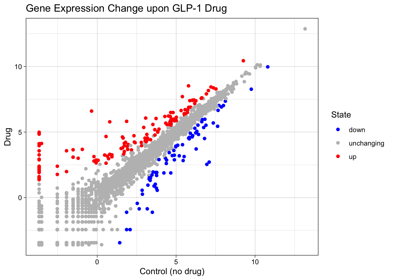
Let’s have a look at the famous gapminder
url <- "https://raw.githubusercontent.com/jennybc/gapminder/master/inst/extdata/gapminder.tsv"
gapminder <- read.delim(url)head(gapminder,5) country continent year lifeExp pop gdpPercap
1 Afghanistan Asia 1952 28.801 8425333 779.4453
2 Afghanistan Asia 1957 30.332 9240934 820.8530
3 Afghanistan Asia 1962 31.997 10267083 853.1007
4 Afghanistan Asia 1967 34.020 11537966 836.1971
5 Afghanistan Asia 1972 36.088 13079460 739.9811Version 1 Plot
ggplot(gapminder)+
  aes(x=gdpPercap, y=lifeExp)+
  geom_point(alpha=0.4)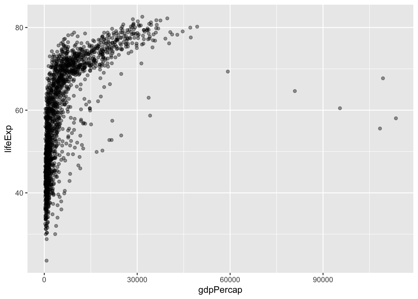
Version 2 plot:
ggplot(gapminder)+
  aes(x=gdpPercap, y=lifeExp,col=continent)+
  geom_point(alpha=0.3)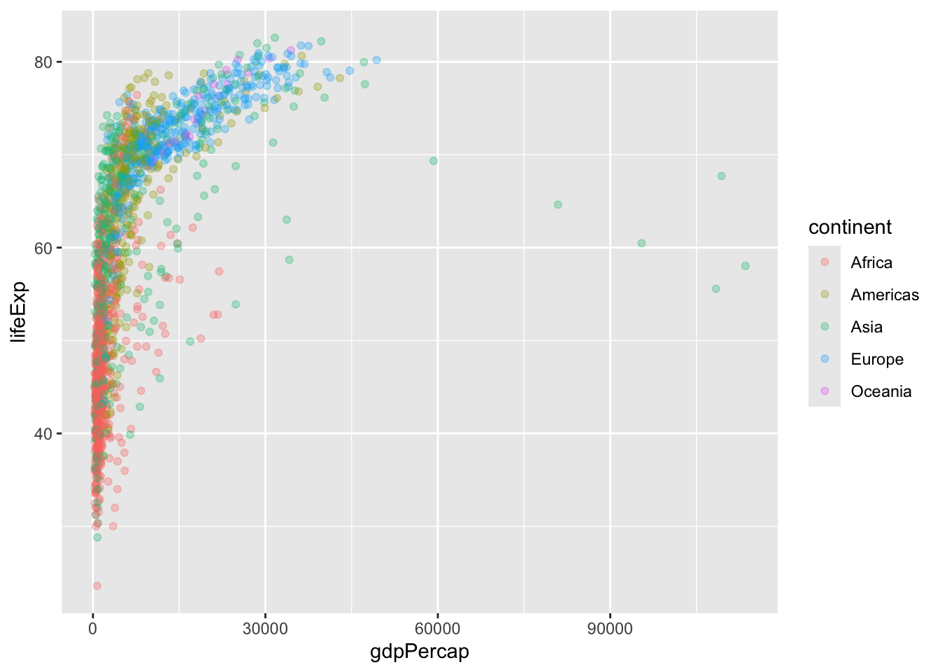
Let’s “facet” by continent rather than big hot mess above
ggplot(gapminder)+
  aes(x=gdpPercap, y=lifeExp,col=continent)+
  geom_point(alpha=0.3)+
  facet_wrap(~continent)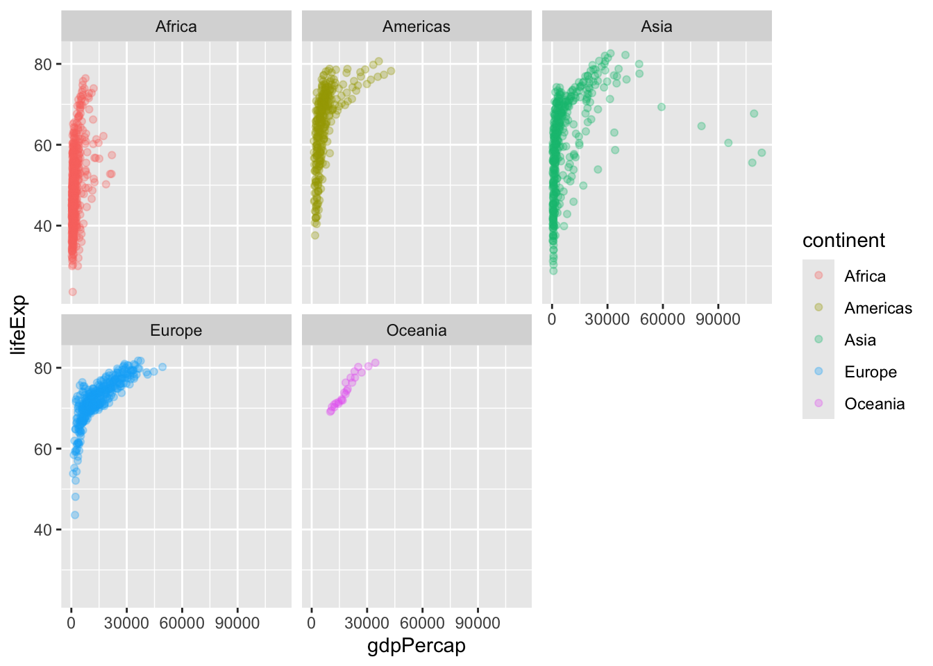
How big is this gapminder dataset?
nrow(gapminder)[1] 1704I want to “filter” down to a subset of this data. I will use dplyr package to help me.
First I need to install and load it up…
library(dplyr)
Attaching package: 'dplyr'The following objects are masked from 'package:stats':
filter, lagThe following objects are masked from 'package:base':
intersect, setdiff, setequal, uniongapminder_1977 <- gapminder %>% filter(year==1977)
head(gapminder_1977) country continent year lifeExp pop gdpPercap
1 Afghanistan Asia 1977 38.438 14880372 786.1134
2 Albania Europe 1977 68.930 2509048 3533.0039
3 Algeria Africa 1977 58.014 17152804 4910.4168
4 Angola Africa 1977 39.483 6162675 3008.6474
5 Argentina Americas 1977 68.481 26983828 10079.0267
6 Australia Oceania 1977 73.490 14074100 18334.1975gapminder_2007 <- gapminder %>% filter(year==2007)
head(gapminder_2007) country continent year lifeExp pop gdpPercap
1 Afghanistan Asia 2007 43.828 31889923 974.5803
2 Albania Europe 2007 76.423 3600523 5937.0295
3 Algeria Africa 2007 72.301 33333216 6223.3675
4 Angola Africa 2007 42.731 12420476 4797.2313
5 Argentina Americas 2007 75.320 40301927 12779.3796
6 Australia Oceania 2007 81.235 20434176 34435.3674filter(gapminder_2007, country=="United States") country continent year lifeExp pop gdpPercap
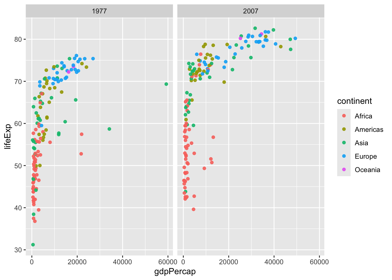
1 United States Americas 2007 78.242 301139947 42951.65Q. Make a plot compring 1977 and 2007 for all countries.
gap_compare <- filter(gapminder,year %in% c(1977,2007))

ggplot(gap_compare)+
  aes(x=gdpPercap, y=lifeExp, col=continent)+
  geom_point(alpha=0.9)+
  facet_wrap(~year)